How and when to use colour in digital images, graphics and text in an accessible way.
What is accessible colour use
When creating your digital learning materials, there are two key accessibility concerns you should consider before using colour. These are:
- the contrast between colours, e.g. text colour and background colour
- how you are using specific colours, i.e. to denote meaning
Colour contrast
WCAG 2.1 Contrast (Minimum) AA (external site) specifies how much contrast you need between your text and the background to be accessible for users with low vision. This changes with the size of the text, so font sizes of less than 18pt (unbolded) require a contrast of 4.5:1 to be accessible whereas font sizes of 18pt and larger require a contrast of 3:1. Note: the ANU gold is only accessible for larger font sizes.
Accessibility checkers
There is an accessibility tool in the LMS text editor which you should use to confirm that any colour contrast is sufficient.
Other tools/apps such as Word or PowerPoint also have accessibility checkers that check colour contrast. However, these tools do not always pick up everything.
If you are concerned about the colours you have used, there are many freely available contrast checkers. Two of these are:
These checkers use the HEX code for colours. If you are not sure of the HEX codes for your text and background colours, you can use a colour picker site to select colours on your screen or in an uploaded image and get the HEX code.
Colour use
There are specific vision impairments that affect a student’s ability to distinguish between particular colours. In addition, for some students, excessive use of colour can be highly distracting and make content very difficult to read.
Using colour for meaning
When creating learning content, do not use colour as the only way to convey meaning. Two common examples of this inaccessible colour practice are:
- Shading or filling cells in a table with a colour to denote status or progress without also including text in the cell.
- Heading levels that differ only by colour instead of by colour and size, or colour and formatting.
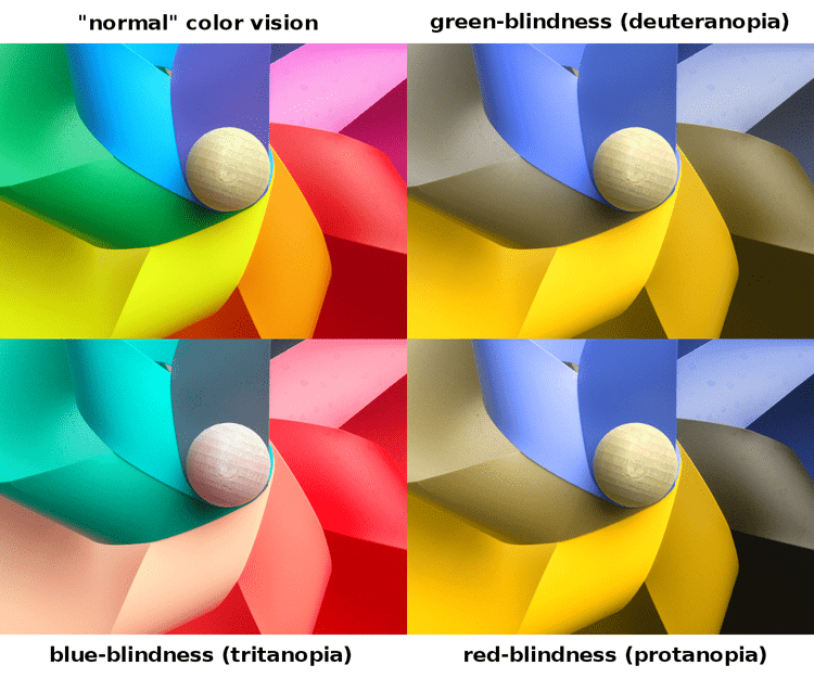
The following image and accompanying long description show how particular colours are perceived by people with specific colour vision impairments.

Colour perception image long description:
- In the top left segment, there are seven distinct colours shown in a windmill pattern: pink, red, orange, yellow, green, blue and purple. This is the reference image for “normal’ colour vision.
- The top right segment simulates how someone with green-blindness would see the reference image. The green and red colours are almost identical. In addition, the blue and purple, and the orange and yellow are very hard to distinguish.
- The bottom right segment simulates how someone with red-blindness would see the reference image. The green and red, the blue and purple, and the orange and yellow colours are hard to distinguish.
- The bottom left segment simulates how someone with blue-blindness would see the reference image. The green, blue and purple, and the red, orange and yellow colours appear as the same basic colour and can only be distinguished by how light or dark the colour is.
Inappropriate use of colour
The following are further examples of practices that are inaccessible for some students and so should be avoided:
- Excessive use of colour, e.g. red, for ‘important’ text on a Welcome page
- Highlighting text, e.g. yellow highlighting throughout a document