Four colour accessibility tips
Four tips to make your Powerpoint slides and Word docs more accessible for students by changing up your use of colour.
As we start a new semester it’s a perfect time to think about increasing your course accessibility. One simple way to help your students is to improve the colour contrast, add texture and use bold or strong for emphasis in your PowerPoint slides or Word documents.
I’ve drawn these basic tips from a January ADCET webinar by Darren Britten (ADCET) and Justin Wylie (CQU).
Tip 1: Styles
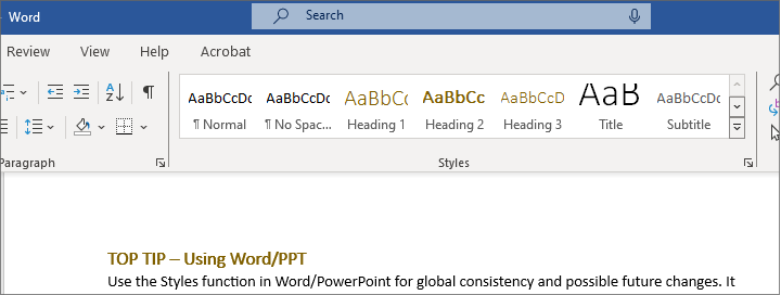
Use the Styles function in Word/PowerPoint for global consistency and possible future changes. It also assists students/users to make adjustments that are most suitable for them. If you’ve not used them before, Microsoft Support has a useful guide.

Figure 1: Image of where the Styles box is located on the Word tab
I created my own version of Styles knowing that the accessibility icon didn’t like the inbuilt templates’ blue. I now use shades of brown – not dissimilar to ANU marketing colours – which Word’s accessibility checker tells me are “good to go”.
There’s a great Microsoft Support page that discusses all the different accessibility changes that can be made to enhance the experience for the person viewing content. Please consider sharing this link with your students. Many people do not know that they may have an issue or need assistance.
Tip 2: Change how you use colour
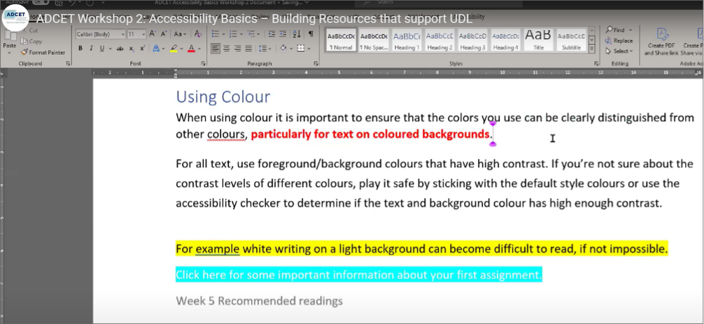
- In the styles function, use bold or strong instead of colour differentiation for emphasis. This heightens the contrast and makes your text visible.
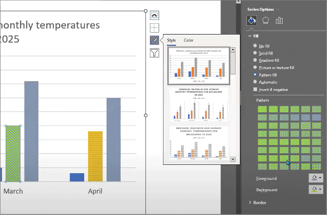
- Use texture as a filler in charts rather than colour only as it’s easier for people with vision colour deficiencies to pick up the pattern/texture differences on screen and in print.
- Avoid using colours as an instructional tool, for example, “Click on the green button on the course site,” as people may not be able to see which button is green, orange, red etc.

Figure 2: Examples of coloured text and highlight

Figure 3: Examples of using patterns
Tip 3: Contrast and bright colours
- Use the accessibility checker when using highlight options as some can be too bright.
- Use the accessibility checker for contrast when using text in a highlight as often it is less visible than you’d expect.
- Check by switching to greyscale to see if there is sufficient contrast with some colours ready for viewing on screen or in print.
Tip 4: Become familiar with the accessibility checker features
- The one in the image above is from the Colour Contrast Analyzer (CCA)
- Can’t find the Word checker? Microsoft Support about the Accessibility Checker.
If you want to learn more or to view some very useful resources, head to the webinar link to download -> Video – ADCET Workshop 2: Accessibility Basics – Building Resources that support Universal Design for Learning – ADCET.
Dr Scott Rickard (she/her) is a disabled staff member with invisible disabilities (neurodivergent +) and is the Education Transformation Lead at the School of Computing.
Other relevant blog posts: Accessible and inclusive teaching tips from a student (opens ANU website)


